Black and White Challenge » You Can Sleep When You're Dead: Blog by Colleen Miniuk

Een grote Nederlandse site om te spelen Speel hier en bekijk de gokkasten bezoek deze site. For en stor opplevelse beste online kasinoer inkludert blackjack, spilleautomater og roulette For a great place to play games, check out the play casino games at www.canada-casinos.net where you can play a variety of games. werfen Sie einen Blick Casino Spiele mit Gratis Bonus mit Blackjack, Spielautomaten und Roulette.Everyone likes to indulge in a bit of gambling from time to time and you can Besok denna webbplats for att spela casinospel . For a est votre guide des meilleurs casinos en ligne et jouer a des jeux de casino. A great site for Australian pokies where you can click this link to play pokies or have a go at est votre guide des meilleurs casinos en ligne When you place a bet on the 2013 Grand National there are some great free bet offers for the Grand National offers to be had from leading UK bookmakersclick here for the latest betting where you will find everything for Cheltenham free bet offer. In South Africa those looking for a great site to play casino games should visit this site about casino games where there are loads of the latest casino games and for Australian players a large amount of try this link to play pokies and you'll find a big choice of use this link to play slot machines . besoka denna kasino Besok denna webbplats for att spela casinospel. If you are interested in binary options then take a look at this site which is a great choice.

Dec 162014
 
Share
Taking Center Stage

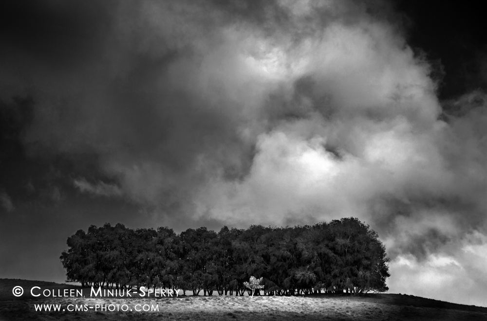
Day 5: “Taking Center Stage.” Row of trees in the pastoral Kohala Mountains region on the Big Island of Hawai’i. (Prints available for purchase – click on photo to order yours!)

Having sat behind a computer for 10 years prior to pursuing photography full-time, I dislike sitting in front of a computer now and post-processing my images for hours at a time.  I would much prefer to spend that time playing outside and perfecting the image in the field rather than “photoshopping” it later.  My post-processing time is generally limited to cleaning up the dust spots, making a few Curves adjustments, sharpening, and more recently, tapping into Tony Kuyper’s awesome luminosity masks.

Not so for my Day 5 Black and White Challenge entry!  I ain’t gonna lie, I worked the heck out of this image in Photoshop!  And boy, did it need it!

I made the original color version a number of years ago while driving the backroads through the Kohala Mountains on the Big Island of Hawai’i.  At the higher elevations, beams of mid-day light poked out from behind the fast-moving clouds, spotlighting various elements of the pastoral landscape.  We had pulled over to explore this scene, one that had grabbed my attention immediately as we approached it at 45 mph.  I liked the way the small tree stood at the foot of a stand of larger trees.  Using my telephoto lens, I tried a number of different compositions to convey this relationship.  In reviewing my frames, though, they all felt too tight to express what I was truly seeing.

I switched to my 24-105mm lens to back off and include more of the moody sky.  I enjoyed how this broader perspective offered a fresh view of scale between the small tree, the stand of trees, and the ever-changing sky.  After a few frames, a soft light illuminated the area surrounding the small tree.  As the light danced, I kept shooting various compositions.  Pleased with my results, we jumped in the car and continued our leisurely drive in the beautiful countryside.  (Post continues after the photo.)

While browsing my images back in Arizona, the image did not stand out among the thousands of frames I created during our week-long trip.  Simply put, I didn’t find it remarkable.  So, the image has been collecting dust on my hard drive ever since. Well, that is, until the Black and White Challenge crossed my desk recently.
UHIKM-00001_color_c

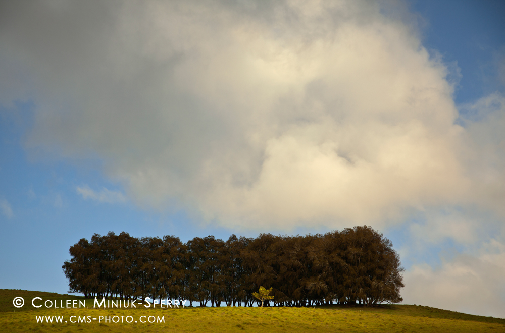
The original color version of “Taking Center Stage”

As I prepared other images for this challenge, I reconnected with the notion of using traditional black and white processing (specifically, burning and dodging). With this in mind, I pulled this image out, dusted it off, and just started playing with Curves adjustments and masks.  A little darker in the sky to frame the primary subject and to make the clouds stand out.  A little lighter in the foreground to grab attention.  A little darker around the beam of light so as to define it better than in the color frame.  A little darker around the edges of the frame to hold the viewer’s eye inside the picture longer.  A little darker in the trees.  A little lighter on the small tree in front.  With each adjustment, what I liked about the original scene started to emerge in the photograph on the screen!

Just for fun, I tried making similar adjustments to the color image, but without much success.  No matter the change, the color only served to distract.  The tones of the small tree blended with the tones in the foreground.  The blue sky felt too calm and cold for how I interpreted the scene (which was like the small tree was trying to take the center stage).  In short, my vision simply needed to be expressed in black and white.

What do you think? Do you prefer the color or monochromatic version?  Why?  I’d enjoy hearing your thoughts in the Comments section below.

What I loved most about this exercise is that it pushed me in a different direction than I’ve been heading for almost 11 years.  The challenge reconnected me with my photography roots, which allowed me to see my photography in a new light (pun intended).  I am grateful to Floris van Breugel for nominating me and giving me this creative jolt.

So, I’m challenging everyone reading this to the Black and White Challenge.  If you have not tried it yet, consider yourself nominated!  If you have already done it, why not try it again with five new images?

You do not have to be on Facebook to participate (and don’t use that as an excuse to not participate)!  Experiment, play!  Pick out several images you think a black and white treatment would improve the image.  If needed, learn how to do selective adjustments in post-processing (e.g. Levels and Curves with masks) so that you get the feel of how selectively burning and dodging enlargements from film helped deliver a final vision in the traditional darkroom.  Evaluate your results.  What do you like about what you see?  What don’t you like?  Change what you don’t like, keep what you do.

Not every photograph will be a successful one in black and white, but just by trying, you’ll be learning new things about your photography, about your craft, and most importantly, about yourself as a photographer.

Keep shooting!

~Colleen

Dec 152014
 
Share
OR_Nehalem Bay State Park_00002_BW_c

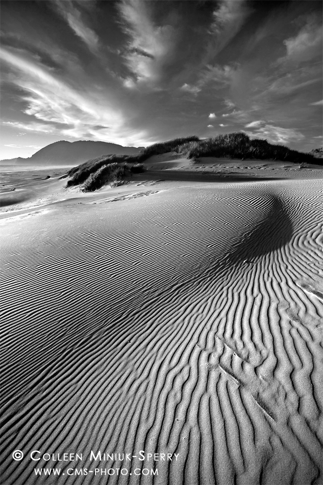
Day 4: “Spellbound by Sand.”Sand dunes in wind-swept patterns on the beach at Nehalem Bay State Park, Oregon (Prints available for purchase – click on photo to order yours!)

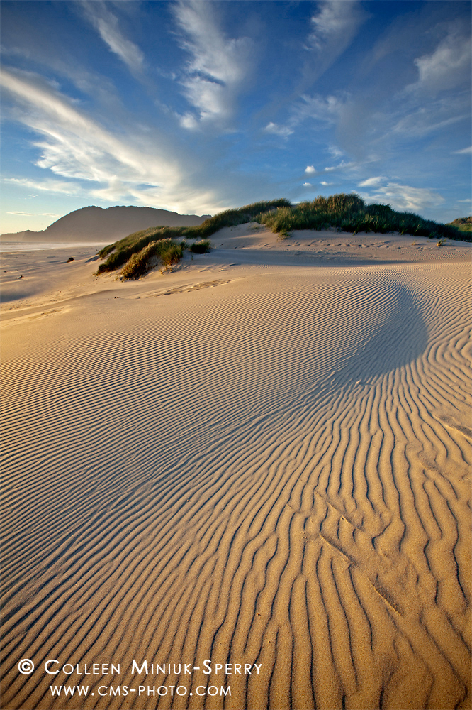
After seeing how much texture the black and white conversion brought out in my Day 2 Black and White Challenge submission, “Down by the Sea“–and liking it!–I decided to try dropping the color out on other Oregon coast shots I had made.  I dug up  a few photos, including a vertical image called, “Spellbound by Sand” (some might recognize its horizontal sister image, “The Constancy of Change“) from my wanderings at Nehalem Bay State Park from two summers ago:

Spellbound by Sand

The original color version of “Spellbound by Sand.” (Prints available for purchase – click on photo to order yours!)

With the setting sun approaching the horizon, the light and shadows seemed to literally dance across the sand dunes.  The howling and unrelenting wind added to this effect, of course (and kept the area free of footprints!).  Focused on emphasizing this perception, I positioned my tripod about waist-high and pointed my wide-angle lens (i.e. 16mm) down towards the dunes.  The distorted perspective allowed me to seemingly elongated the lines in the sand and to fill the frame with my primary subject.

To maximize my depth of field, I used an f/16 and focused at the hyperfocal distance for my lens and aperture setting (i.e. 2.82  feet away from my camera, according to the DOF Master, dofmaster.com).  At an ISO speed of 100, a shutter speed of 1/10th second resulted.  Knowing if I exposed for the land, the sky would appear overexposed and blown out (and if I exposed for the sky, the land would appear underexposed and too dark), I placed a three-stop graduated neutral density filter over my lens to hold back light in the sky.

Before snapping the shutter, I followed the dominant lines around my frame, taking great care in ensuring the lines did not lead the eye out of the frame.  As I shifted a little to the left, then a little to the right, and then settled in on a composition I liked, I noticed the strongest lines originate from the bottom left corner, travel to the small mound off to the right near the middle, and then push into the explosive-looking sky.  I knew from the moment of capture, this photograph possessed a great deal of energy given the lines in the sand and the backdrop Mother Nature provided in the clouds.  I liked that the image conveyed how I felt about the scene – in words, an emphatic and enthusiastic “WHOOHOO!”

When I experimented with converting the image into a monochromatic one, the black and white format transformed into a trippy–almost spastic!–mesmerizing optical illusion.  If you look at it long enough, the sand looks as if it’s moving!  In post-processing, I increased the contrast in the sand to amplify the effect even more so.  Like my Day 2 photograph, “Down by the Sea,”  the monochromatic treatment emphasized the alternating highlights and shadows in the foreground and created a greater feeling of dimension to the final image.

Which version do you prefer: the black and white or the color image?  And why?  Leave me your thoughts in the Comments section below.  I’d love to hear from you.

There are a whole slew of tremendously talented photographers working primarily in black and white.  One of those is my buddy, Chuck Kimmerle.  Chuck already completed the Black and White Challenge by sharing some lovely work.  But I think he might have gotten off this challenge too easy (since he works almost exclusively in monochrome).  With a little twist on the assignment, I challenge Chuck to post five COLOR photographs over the course of five days.

On to Day 5 tomorrow!

~Colleen

Dec 122014
 
Share
The Network_BW

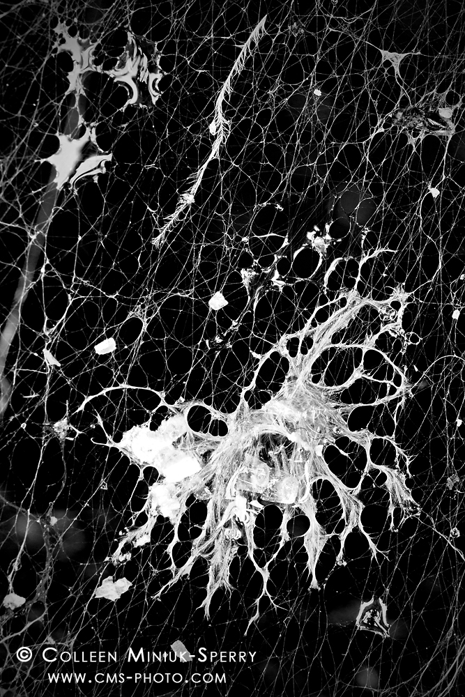
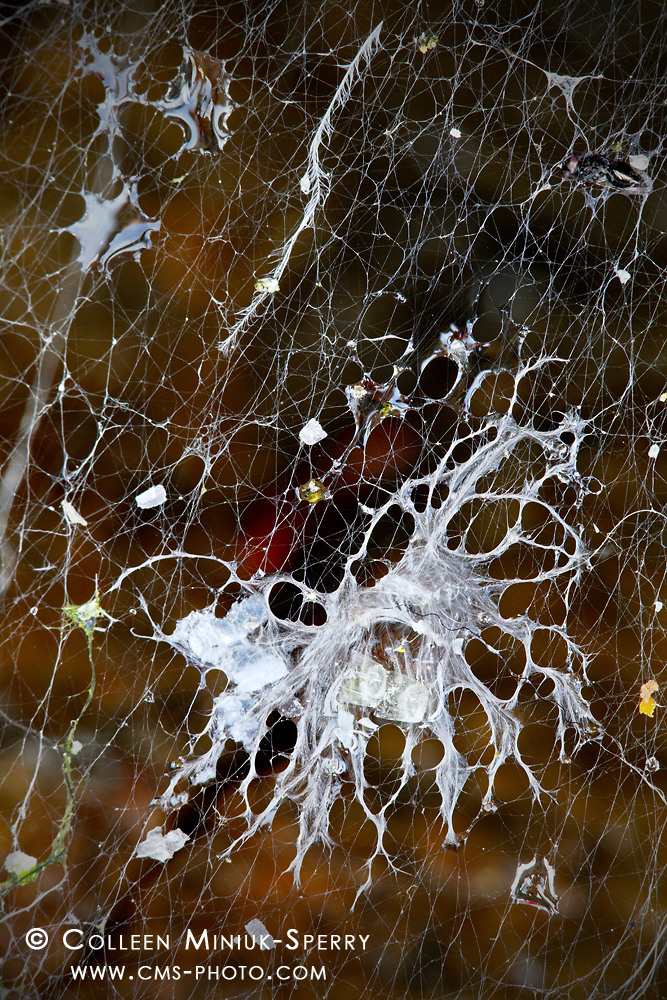
Day 3: “The Network.” Feathers, water droplets, and other materials float in a spider’s web on Schoodic Point on the Schoodic Peninsula in Acadia National Park, Maine (Prints available for purchase – click on photo to order yours!)

For Day 3 of 5 in the Facebook Black and White Challenge, I am excited to share a new abstract piece (above) titled, “The Network” from the Schoodic Point on the Schoodic Peninsula in Acadia National Park, Maine.

Amidst a whirlwind schedule of book signings and presentations in Acadia this past August, I managed to escape to Schoodic Point for an afternoon of revitalization and refreshment.  With no intentions or expectations of photographing, I simply strolled along the strikingly beautiful pink granite ledges at one of the park’s most scenic overlooks.

Having visited the point likely 60-70 times over the last four years, I continue to find scenes and things that amaze me–from the gi-normous waves explosively greeting the Maine coast to the way the granite and basalt dikes intertwine.  I never know from trip to trip whether the landscape or the smaller details will be the first to reach out and grab my soul.  Either way, Schoodic Point seems to speak to me every time I come to say hello.

On this particular visit, one minute I was watching the waves in quiet reverie.  The next minute, as I turned my head away and spotted a small spider web strung across the boulders, I lost my mind, “OH MY GAWD, HOW AMAZING IS THAT?!!”

I rushed to the granite overhang to investigate my flash of perception more closely.  With my camera still in my backpack, I approached this 3-foot by 1-foot area with curiosity, appreciation, and admiration.  Truth be told (and perhaps not surprisingly, given my “air bubble” obsession), I was first draw to the water droplets suspended in between the threads (on the top right in the photo below).  The longer I studied this arrangement, though, the more I connected with a large clump of unidentifiable material in between the feathers.  Was it decaying feathers?  Fur from an animal?  A dead animal?  When the creative flow hits, you do not ask many questions.  You go with the flow–which is exactly what I did as I set my equipment up to make an image.

The Network scene

The scene of the scene: a spider web strewn across the granite boulders at Schoodic Point. Had I picked my camera up and snapped immediately after having a flash of perception, this would have been the photographed that resulted. Instead of grabbing a camera, I investigated the scene and ask over and over, “What is it that I love about this scene.” This yielded a more focused, more meaningful image of the cluster of tangles in between the large three feathers on the left.

To get a closer perspective, I reversed the center column on tripod such that my camera dangled upside down.  With a macro and two extension tubes stacked, I knew my abilities to record anything but a ridiculously shallow depth of field would be tough.  So I positioned my lens parallel to my primary subject to maximize the appearance of focus across my frame. The setting sun grazed the boulders, so I placed my rain jacket across two of the tripod’s legs to help create a larger shadow (and block the wind) across my scene.

Given the coastal breeze, I made an “insurance shot” at ISO 640 using f/6.3 at 1/25th second.  I knew this frame would not render the depth of field I needed, but would allow me to freeze the moving web during the exposure.  I also knew it would yield a sufficient enough shot to give me the freedom to push my settings slower and try to expand my depth of field in additional frames without the risk of going home empty-handed (or with a bunch of blurry images on my memory card).

I dropped my ISO to 400 and stopped down to f/9, which resulted in a 1/4 second shutter speed.   With each lull in the wind, I snapped away on continuous shoot mode (a.k.a. “machine gun” mode) as the web danced in the afternoon winds.  After making a few series and reviewing the images on the camera’s LCD, I felt I had successfully recorded the photograph as I envisioned.  Here’s the original color photograph (post continues after photo):

The color original of "The Network"

The color original of “The Network” (Prints available for purchase – click on photo to order yours!)

However, when I began editing my images at home in Arizona, I liked the end result; surprisingly, I did not love the end result.  The reason(s) why alluded me.  I mean, everything seemingly fell into place when I photographed the web: I had passion about my subject.  I took ample time to develop a visualization of what my end results would look like.  I filled the frame with my subject.  I arranged the various elements to achieve asymmetrical balance.  Conditions provided conducive lighting.  My depth of field rendered an adequate amount of sharpness for the subject while blurring the background.  It was close, but not perfect.  I set the image aside.

Oftentimes, it helps to create distance between you and a problem as this allows you to collect new ideas and gain fresh perspectives in order to solve them.  When Floris van Breugel nominated me for the Black and White Challenge in late October, this image immediately popped into my head.  The monochromatic direction gave me just the boost I needed – a new idea to try!

I converted the image to black and white, and instantly my photograph became as creepy and weird and abstract as I saw on the granite ledges that August afternoon.  I originally believed the color background added to the chaos.  And in many ways, it does.  But when I dropped the color out, my vision for this scene finally came to life.  Now I love the end result!

Do you agree?  What differences do you see between the color and monochrome versions?  I’d enjoy hearing your thoughts in the Comments section below.

Since I have shared an image from Acadia National Park, I would like to nominate my good buddy, talented photographer, and best-selling author, Bob Thayer, to participate in the Black and White Challenge!  (If you have ever visited a gift shop near Acadia, you have no doubt seen his awesome books, “The Park Loop Road” and  “Acadia’s Carriage Roads.”)

On Monday, I’ll share Day 4’s photograph.  Have a great weekend, everyone!

~Colleen

Dec 112014
 
Share
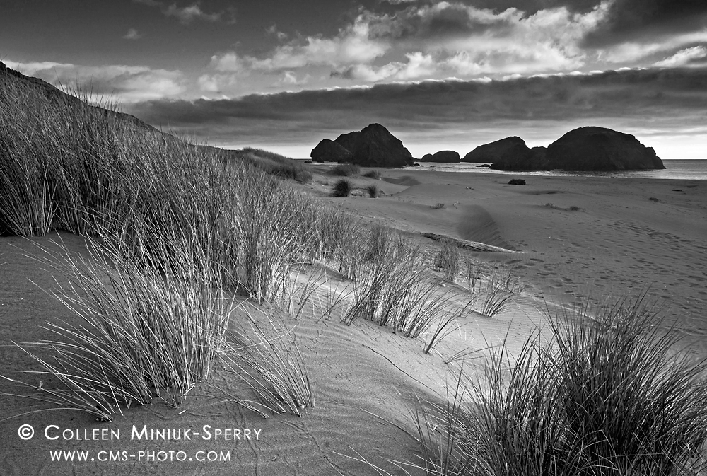
Down by the Sea (monochromatic version)

Day 2: “Down by the Sea,” European beach grass lines the sandy shore at Pistol River State Park, Oregon (Prints available for purchase – click on photo to order yours!)

In my post yesterday’s “Day 1: The Black and White Challenge:  “In the Storm”, I introduced the Facebook Black and White Challenge (and my participation in it).  In this fun exercise, a person posts a black and white photograph on his or her Facebook page each day for five days.  Then, he or she challenge someone else to do the same each of those days.

For my Day 2 entry, I’m jumping from the Maine coast to the Oregon coast (my two loves)!

A cancellation in my schedule this past September left me with a rare 10-day time frame completely free of commitments.  With this gift, I did what any sane outdoor photographer would do:  I hopped into my truck and drove 22-hours from Arizona to the southern coast of Oregon!  (What we’ll do for love, huh?)

I have spent much time wandering the Oregon coastline over the years, but the majority of that time I spent happened in the more accessible middle and northern sections.  However, every time I drove from Gold Beach to Brookings (usually to visit northern California and other southerly locales), I said to myself, “If I ever have a week or two weeks to spare, I’m coming here to explore!”  So, by traveling so far, I wasn’t losing my mind; I was merely fulfilling my promise.

One of the many highlights from my impromptu road trip included exploring the Pistol River State Park.  For my first few visits, I did not make any photographs but rather simply soaked in what this special place had to offer.  Sure, some photographic ideas popped into my head, but they needed some time to simmer.

Towards the end of my trip, a nasty storm socked the coast in for a couple days.  I continued my explorations and made some new images in various locales north of Brookings, much of it in blissful solitude, even at the more popular stops.  After all, it was only rain!  (Have the Oregon coast to myself?  Don’t mind if I do!)

When the weather forecasts suggested the system might break (which was timed coincidentally with the next sunset), I headed back to Pistol River area for one final visit before returning home to the desert.  With the light dancing in and out of swiftly-moving clouds, I knelt on the sand beside clusters of European beach grass.  Using my visualizations as my guide (but modifying my original idea to respond to the fleeting lighting conditions), I adjusted my composition so as to achieve balance between the grasses, sand, sea stacks, and the ever-changing sky.

Through a wide-angle lens (i.e. 20mm) I used an ISO 100 and an aperture of f/16 with a shutter speed of 1/13 second.  I chose these specific settings to help balance my need for extensive depth of field and the perpetual movement in the grasses given the prevailing winds (which was strong enough to keep the beach grasses waving, but not enough to keep the animal and human footprints from disappearing in the sand).  Because of my close proximity of my camera to the grasses,  I would have liked to have used f/22 to see an extensive depth of field.  However, after experimenting with the slower shutter speed that setting caused, I didn’t like way the grasses appeared in the photo (too much movement and way too soft).

So I took a small step back from the grasses, set f/16 (still needed extensive DOF), and tried again with a 1/13th second shutter speed.  I really liked the combination of still and moving grasses this rendered – frozen enough to see what it was, but blurred enough to see the wind was moving.   Theoretically, if I wanted to freeze the motion of the grasses (which was not my goal), I could have bumped the ISO up to ~400 or 640, took another step back, opened my aperture to f/11 or f/8, and snapped away with a faster shutter speed.

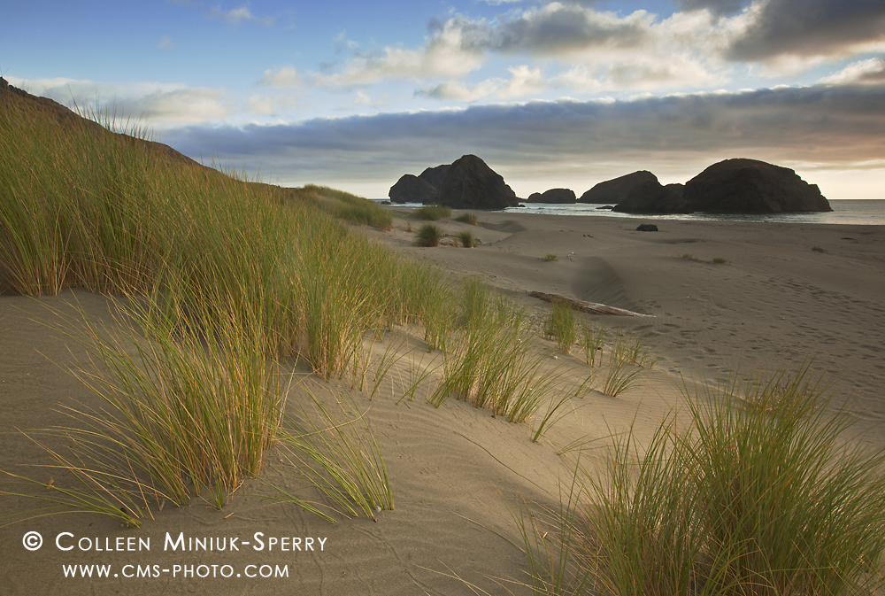
My three-stop graduated neutral density filter helped to bring out detail in the clouds, but also darkened the off-shore rocks in the background. This resulted in the following color photograph (post continues after photo):

Down by the Sea

The original “Down by the Sea” in color (Prints available for purchase – click on photo to order yours!)

I definitely did not visualize converting this image to black and white when I snapped the shutter.  I did not even consider it when I arrived home and began processing the photos.  However, the Black and White Challenge caused me to rethink my approach with my pictures.  As I sorted through my images for this exercise, I had some interesting philosophical conversations with myself on things like, “How do various color impact a scene?” “What makes an effective black and white image?”  “How can I use both color and monochromatic techniques to improve my visual messages?”  When I experimented with converting this image to black and white, I felt like I was dusting off my traditional darkroom tools developed 11 years ago and putting them back into use to expand my creative toolbox today.

The monochromatic treatment emphasized the light and shadows alternating and working together in layers across the scene, more so than in the color version.  While I could have lightened the sea stacks in the background during post-processing (to overcome the underexposure from the graduated neutral density filter), I did the opposite.  I intentionally darkened the rocks in the monochromatic version to serve as a more dominant backdrop.  I felt this matched the more aggressive mood in the sky.  Both the darker backdrop and sky served as a juxtaposition to the more flowing, gentle grasses highlighted by a ray of sun in the foreground.

What do you think? Do you prefer the color or monochromatic version?  Why?  I’d enjoy hearing your thoughts in the Comments section below.

Since he started me on this challenge, I now re-nominate Floris van Breugel to finish his Black and White Challenge.  Only two more photographs to go, Floris!  You can do it!

Stay tuned for Day 3, thanks for stopping by,

~Colleen

Dec 102014
 
Share
In the Storm

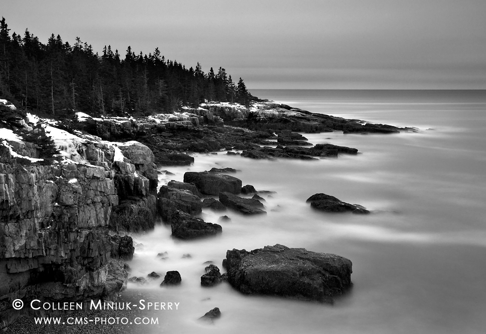
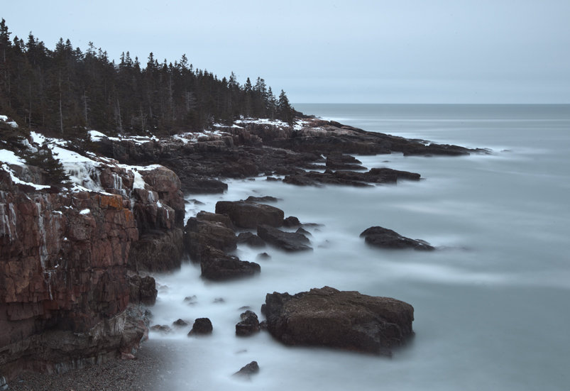
Day 1: “In the Storm,” waves roll into the Schoodic Peninsula’s rugged western coastline in Acadia National Park, Maine (Prints available for purchase – click on photo to order yours!)

If you have spent any time on Facebook in the last several months, chances are high you have run across the “Black and White Challenge” making its way from photographer to photographer.  For those unfamiliar with this social media experiment, it goes something like this:  Post a black and white photograph on your Facebook page each day for five days.  Then, challenge someone else to do the same each of those days.

Although I enjoy viewing monochromatic images (both in general and during the recent Facebook challenge), I had not thought about black and white processing for my own work for quite some time.  About 11 years to be exact…

Wheels in Montana_CGCC

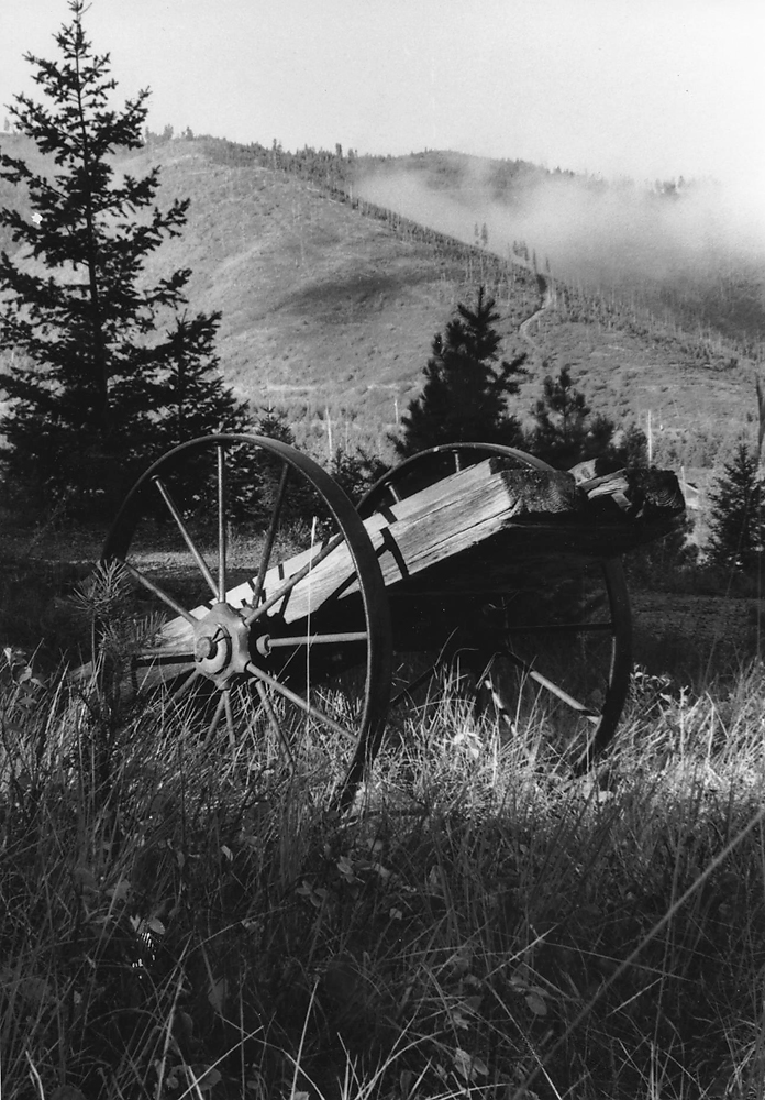
Humble beginnings: I made this image in the fall of 2001 (from my 7th roll of film). I knew little about light or composition at the time, but I really liked how the light illuminated the logging wheels while the fog cleared from the hills in the background at my husband’s childhood home outside Missoula, Montana.

To escape the stresses of intense corporate life, I began taking photography courses at the Chandler-Gilbert Community College in September 2001.  Through my five semesters of classes (until the end of 2003), I learned what an aperture was, how to slow my shutter speed, ways to compose effectively, and many other foundational techniques.  I also vividly remember learning that a black and white image should possess a bright white tone, a rich black, and a nice range of greys in between (the lack of such combination being one of the reasons some high dynamic range, or HDR, images fail, in my opinion…but I digress).

Eager to expand my photographic repertoire, in late 2003, I tried my hand at color slide film.  I instantly found shooting in color helped me better express what I loved about what I saw and experienced in the outdoors.  Despite the lingering and unforgettable fumes of stop bath and fixer trying to tempt me back to the darkroom, I chose to pursue my work in color…and as a result, the few remaining rolls of black and white film I owned aged well beyond their expiration date in my refrigerator.

Fast forward to this past October.  During the Black and White Challenge on Facebook, my good buddy and talented photographer, Floris van Breugel nominated me to participate.  Since then, I have scanned my collection of images, experimented with many in the digital darkroom, and finally selected five to offer to the challenge (and in the process, remembered just how fun it was to watch your photograph come to life in the darkroom trays while chit-chatting with your photographer friends.  It was kind of like sitting around a warm campfire, only without the s’mores and tequila…). While I am a little late in joining this party, as the idiom goes, “Better late than never.”

With that, my first contribution to the Black and White Challenge is “In the Storm” (image atop this post) from the Schoodic Peninsula in Acadia National Park.  This past February, while making my standard rounds along the western shoreline in the late afternoon light, I reconnected with one of my favorite views.  I had high hopes that the fast-moving winter storm would break into a magical fiery sunset just after the sun disappeared behind the horizon.  As I waited, I played.

Specifically, I experimented with various shutter speeds to render the waves kissing the rugged cliffs into an ethereal mist.  To do so, I slowed my exposure settings down as much as possible:  ISO 50, f/22 at 30 seconds.  I also added a three-stop graduated neutral density filter over the top portion of my frame, so as to darken the clouds and to pull some additional texture out.

When I looked at the results on my camera’s LCD, I enjoyed the composition and the idea of moving water.  I felt, though, as if the motion effect (even at 30 seconds) was still too fast for what I envisioned.  I turned to my Lee 10-stop Big Stopper neutral density filter to help me slow my shutter speed even further.  I set the final exposure to ISO 50, f/22 at 502 seconds while using the Big Stopper filter in front of my lens.  Here is the original color image (post continues after the photo):

Maine_Acadia National Park_00226_original

The original color image of “In the Storm”

When processing the photo on the computer, I decided the colors were not important to me conveying my desired message for this scene.  On top of that, the even, diffused lighting lacked contrast and perhaps a little shape.  In technical terms, it looked blah.

As we review in many of my workshops, if it’s not helping your story, take it out!  I eliminated the color tones and increased the contrast through a series of spot-specific Level adjustments (like burning and dodging to achieve “a bright white, rich black, and a range of greys in between” in the traditional darkroom).  While blue hues typically feel cold, I believe the image took on a sharper, even colder feeling, once I dropped the gloomy color out.  Also, the increased contrast the black and white image displays offers the illusion of greater dimension and shape than the color version.

Do you agree?  Which version of this image do you prefer and why?  I’d enjoy hearing your thoughts in the Comments section below.

To fulfill the requirements of the challenge – and in honor of my Chandler-Gilbert Community College days – I nominate my dear CGCC friends on Facebook to participate:  Mona Burato, Patty DeBermuda, and Lynn Welter!  Let’s see what you’ve got, ladies!

Until tomorrow – Day 2!

~Colleen