“Choose Wisely,” Acadia National Park, ME || Prints available! Click on photo to order yours!
If you’ve spent any amount of time in photography, you’ve inevitably heard about the “rules” of composition. Specifically, we hear messages like “Make the most of leading lines,” “Look for balance,” and my favorite, “If you place your primary subject in the center of your frame–outside one of the four intersection points of the Rule of Thirds–you’ll spontaneously combust.” Then, once we understand what those rules are, we’re advised to “Break the Rules.”
The so-called rules of composition were designed to help photographers organize the chaos of nature into a rectangular frame. Although well-intentioned, such simplistic advice has unfortunately misguided many-a-photographer into believing that following the rules will result in an effective photograph. See, the trouble with rules is they only get you so far—at best, a beautiful, technically-perfect image…which may also look formulaic and uninspiring to you and your viewers.
The key to better composition in photography is not adhering to the Rule of Thirds “better.” It’s not “Making the most of leading lines” more often either (To be honest, I have no idea what that even means). The rules tell us what to do, but fail to explain why we should employ such techniques.
The path to better composition starts with developing your own meaning of a subject or scene then deliberately designing your frame such that you convey that meaning through your use of positioning, visual weight, balance, lines, layers, light, and color. If you understand human perception, you can arrange your visual elements to get your viewers to see and feel exactly what you wish. That is, if you pay attention to how humans think and interpret the world, you already know the “rules” of composition.
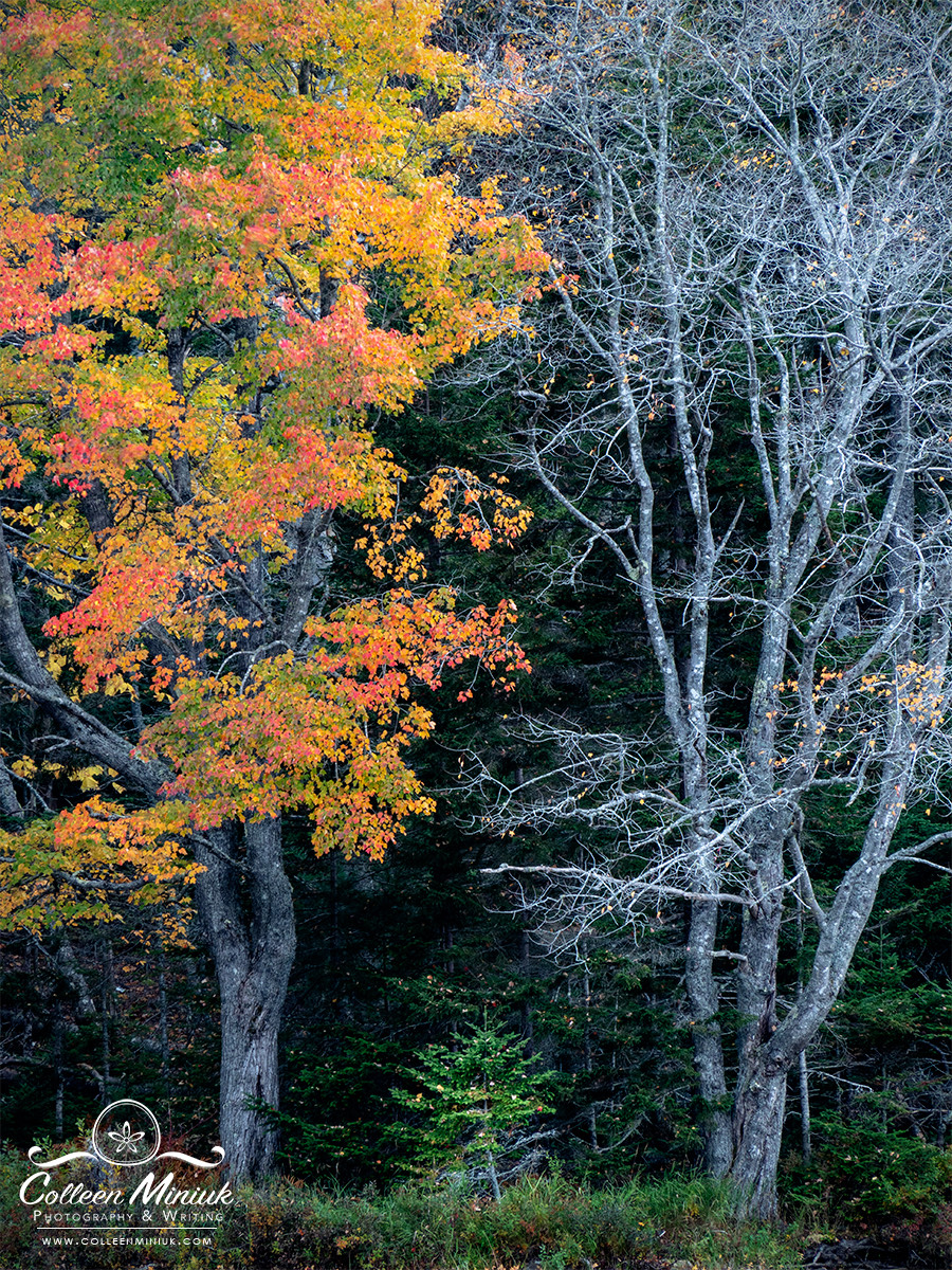
I call the above photograph, “Choose Wisely.” When I came upon the scene at Little Long Pond in Acadia National Park in Maine this past fall, I was first drawn to the stark contrast between the colorful and vibrant maple tree on the left of the frame and the bare one on the right. I started wondering what could have caused such a disparity between two trees so close together.
I also started visualizing how I could compose my frame to showcase this difference. I had already decided I didn’t need the full set of branches included in my frame, which dictated the use of a telephoto lens to zoom in on my subject. I had already decided I didn’t need the foggy sky in my frame either to convey my message. It was only after I asked myself whether I needed to show the trunks of the trees when I noticed the small conifer beneath these two maples and a new, more powerful message started to surface.
I started making up a story about this evergreen tree, thinking it appeared to have two choices ahead of it as it grew into adulthood: a vibrant and full life (left tree) or a bare one. But it actually had a third: to be its own self in the only way a conifer knows how. This story set the foundation for all my compositional decisions—I wanted to convey this story, or at least one close to it, with my viewers.
To do so, I intentionally positioned the evergreen an equal distance from either maple tree to show a “stuck-in-the-middle” pull between the two “choices,” the two trees, which I gave equal space to in the frame to create a balance of power between the two—a classic “good vs. evil” conflict. By including a substantial amount of the height in the deciduous trees relative to the smaller conifer in my frame, I established an authoritative relationship (e.g., an adult-child relationship). I experimented in raising and lowering my tripod to give the evergreen just enough space to imply upward growth. (I definitely didn’t want any of its branches touching either of the other trees.) I chose a vertical composition over a more peaceful horizontal orientation to increase tension and drama. In processing, I darkened the background to allow the little evergreen, which was catching a touch of light from the sky on the side facing me, to stand out more.
Did I make the most of leading lines? No.
Did I place my subject in the intersection points of the Rule of Thirds? Again no. (And guess what? I haven’t spontaneously combusted…yet…).
Did I pay attention to balance? You bet I did, but not in the way I’ve been told to do.
Did I do so to follow rules of composition? Honestly, I couldn’t care less.
Did I deliver the story in the way I wanted to? Absolutely. This is what I wanted to say about my experience with these trees in Acadia that afternoon.
As Robert Henri said, “Making lines run into each other is not composition. There must be motive for the connection. Get the art of controlling the observer – that is composition.”
So when it comes to composition for your own photographs, rules or human perception? Choose wisely.

